Wednesday, November 28, 2012

Dimension/Depth/Space/Scale

-->
Practically every product designer uses Computer Aided Design or CAD software in the development process. It helps visualize the product in a 3d virtual environment. The product can be altered and prototypes can be made, but the software enables the team to view the object or structure from different angles so changes can be made before prototypes are constructed. This coffee cup shows how you can see different angles with CAD software. 


CAD offers advantages when designing architecture as well. These models show how buildings and floor plans can be designed and altered in a 3D environment. 


The three examples show how software can help in the design process. They also show how important depth and size perception is when designing products and architecture.

The coffee cup provides a representation of the object in a virtual environment. There aren’t any cues that show how large it is in relation to anything else, but a coffee cup is a common object, so its relative size is understood. Shading and the overlap of the front and back walls of the cup provide the depth.

The models of the house and floor plan have more depth perception cues than the cup. Linear perspective is used and can be seen in both examples. The scenes get smaller towards the back than they do towards the front. Overlap can be seen in the trees as well as shading (the tree furthest away is partially covered by another tree, and it is shaded darker than the others). The floor plan uses overlap, as well as relative size. The cubicles towards the back get smaller than the ones in the front. Also, the walls of the cubicles in the front partially cover the walls of the cubicles in the back.


References:

Architecture from outside:

Floor Plan:

Cup:

Wednesday, November 14, 2012

How Tone is Operating


How Tone is Operating: There are a couple examples of tone use in these Braun watches. For watch #1- Black is used for the numbers, notches, writing and the band. The light grey face of the watch sticks out from the dark black of the band. The black notches, writing, and numbers stand out against the grey face, making them readable. The second watch uses tone in a similar way, only the face is black, and the notches are white. The numbers are very difficult to read since they are a close tone to the black face. The contrast between the face and the symbols are what make them readable, or in the case of the second watch, unreadable.

How tone is interacting: Tone is interacting with line and shape elements in both of these watches. The lines of the watches interact with tone most importantly. The lines that mark the time are a contrasting tone when compared to the face. Also, the seconds, minute and hour hands are lines, and are also a contrasting tone. These lines (hands) are essential in the function of an analog watch. It is important to make these easily visible, and to make to noticeably different to the background.

How Color is Operating: Color is another design element of both these watches, just on a much smaller scale than tone. Both watches use two different colors to call attention to certain parts, yellow and red. These hues are basic and easily noticed. The second hand is yellow, and the date has a red arrow to the left of it. The second watch uses color in a much more subtle way. The seconds’ hand is a dark orange color. There is luminosity contrast at work in both examples. The first watch has more contrast than the second watch, making the colors stick out a little more.

How Color is Interacting: The color in both of these watches is again primarily interacting with the basic element of line. The yellow and orange color appears on the second hand in both the watches. These hands are lines. The color makes them noticeable, but the skinniness of the line (which is the second hand, and the smallest one) makes it less noticeable. Two angled lines that make an arrow form the red colored shape next to the date. The red color makes the lines stick out. The luminosity contrast it creates makes I more noticeable than if it where similar to the grey face.

Wednesday, November 7, 2012

Visual Elements of Surface Design

I chose surface design as the design field for this assignment. I'm gong to discuss the process of designing a pattern that could be used textiles or backgrounds or whatever it would look good on. 

The process begins with a series of lines. Lines are one of the most basic visual elements. The picture below has a few lines that are darker than the other lines and shapes. This is to show that they exist. These lines are the basics of this pattern. They are very similar to one another. The main difference is the direction they face. When more lines are added in purposeful directions, they begin to form the next basic visual element, shape.


The picture below shows all of the lines you saw above, with the addition of many more, and with complete opacity. The end points of the lines touch and overlap in places. This process creates certain shapes. With the same couple of lines, a pattern can be formed. The repetition of basic shapes (triangles and squares) creates a design that is suitable for surface design. This design could be applied to surfaces now, or it could be improved by adding a more complex basic visual element, color.


The image below is the same pattern we saw earlier, just with the addition of color. The black lines have been replaced with white lines. All of the triangles and most of the squares have been filled in with blue. Certain Squares have been filled in salmon color. Color can be a very powerful tool. It can change the entire feel of the design very quickly. Whether or not you are designing for textiles, web, industrial, etc, you should understand the power color has.


Thursday, November 1, 2012

Visual Thinking

Visual Thinking

The first puzzle I chose was Counting Triangles by Henry E. Dudeney. It was similar to the square counting puzzle we did in class. The star with a pentagon around it has a bunch of different triangles within it. We had to locate as many triangles as we could. I came up with 25, and my friend came up with 25 as well. We used similar techniques of pattern seeking when searching for triangles. We both began counting the obvious triangles, and counted each one in a circular motion. We noted that there are sets of different sized triangles. Each set had five triangles that were exactly the same. We didn’t find three of the sets. The total amount of triangles in the pentagon star equals 35.


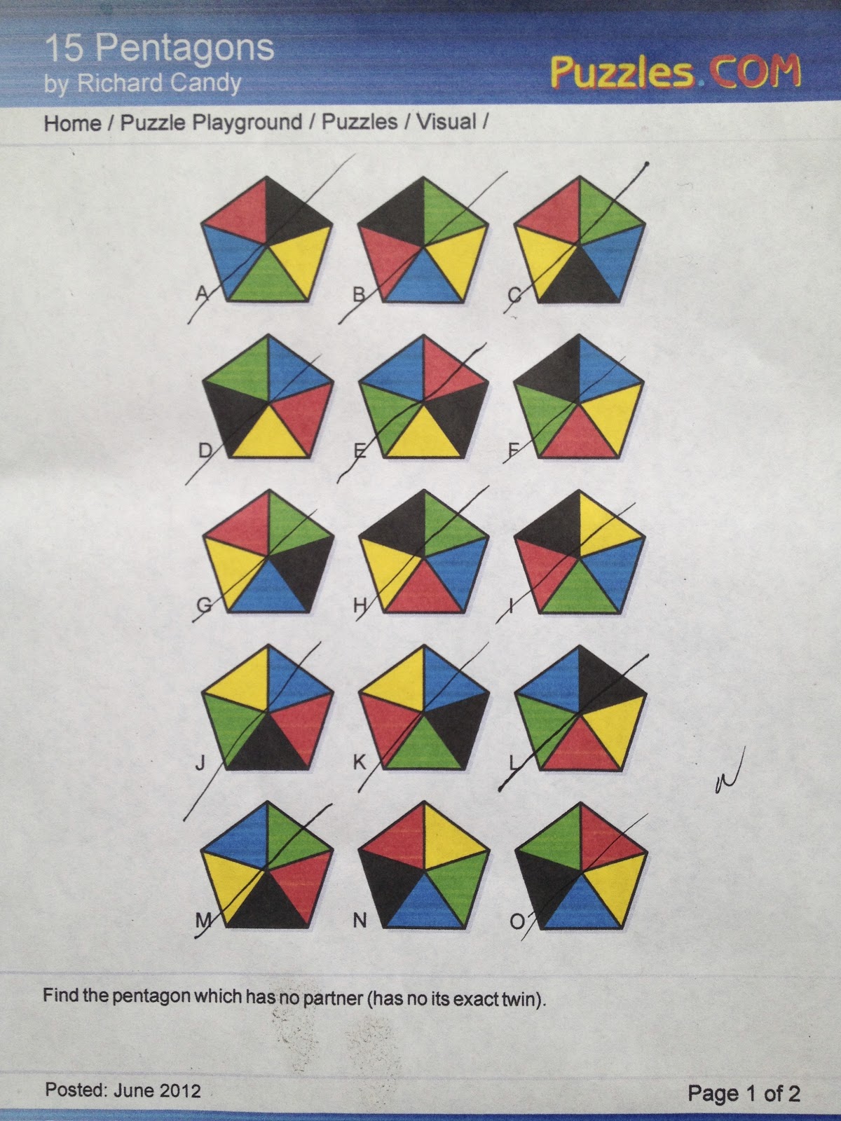
The second puzzle we did was 15 Pentagons by Richard Candy. This puzzle has 15 pentagons (A-O). Each pentagon is separated into five different triangles. Each triangle is colored a different color, each color appearing in a section. There are seven pairs; meaning 14 of the pentagons have a twin. There is one that has a unique pattern. We had to find that unique pentagon. We had to study each pentagon and look for patterns. I used a matching technique. I looked at pentagon A, and matched it to its twin. This was basically a process of elimination. My friend began categorizing each pentagon based on individual traits. By the end, we both had figured out which one didn’t have a twin.


 Answer Keys


Thursday, October 18, 2012

Feature Hierarchy


This is an info graphic that was published on the website good.is. This info graphic shows the percentage of individuals who voted to ban or legalize same sex marriage, state by state. Motion, the most attention grabbing pre attentive feature, is not used here. Interactive info graphics, or those using some sort of animation, could take advantage of motion. Color, the second most effective attention-grabbing feature, is used to a somewhat decent effect here. The only color is in the rope running through the middle of the graphic. It is supposed to be a rope being tied into a knot. I suppose the rainbow color associates it with the LGBT community. The amount of attention this draws from the viewer is almost too much. It sticks out a little too much from the actual information printed in the background, which is all black and white. This represents how color can be a powerful tool in attracting attention. Another color difference (not really color but black and white difference) is the circles. Some are filled black, and others are filled white. You notice the three unfilled circles since their lack of color makes them stick out when compared to the black circles. The third pre attentive feature this graphic uses is size. Some of the black circles are larger than others. The size difference draws your attention to them more than the small ones. The information in the larger circles might be more relevant than the smaller circles.


References:


Website: WWW.good.is/

Thursday, October 11, 2012

Top-down Processing


 Top-down Processing


Ake Axelsson designed this chair. It is called Wood. The chair is made from solid beech. I chose this because of its simple design. When you approach a chair to sit down, you generally take a quick look at it before hand. You are looking for a purpose, which is the essence of top-down visual processing. Your goal is to sit down in this unfamiliar chair, so you want to make a few observations before you rely on the chairs structure, cleanliness, and surroundings. Your eyes make rapid fixations on the chair and what’s around it. You look at the seat and back rest. Is the chair dirty? Does it have a cushion? How comfortable will it be? Then you might scan the surrounding area. If there is a crazy person sitting in close proximity, you might look for another seat. Once you make these quick observations, you take more time looking at the chair as you approach it. These longer fixations are more in tune with your ultimate goal. The walk up to the chair might reveal something you didn’t see before hand. Maybe the leg of the chair is bent, or you overlooked a piece of gum stuck to the backrest. If these longer fixations don’t turn up anything unsettling, you take the chair as your seat.

Image: 
http://www.decoist.com/2010-11-19/an-amazing-chair-ake-axelssons-wood/

Thursday, October 4, 2012

Syntactical Guidlines - Design Success & Failure

-->

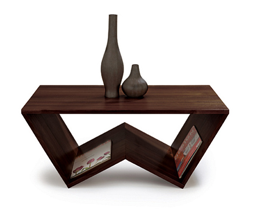
This is a picture of the Mimosa Coffee Table by Matt Carr. The continuous plank of wood creates a simple, yet functional piece of furniture. Magazines can be held in the center portion of the table, which when full, would provide literal and visual bottom weight. The symmetrical W shape of the furniture provides solid base, creating a sturdy coffee table.


This is a picture of a Three Legged Chair by Joaquim Tenreiro. The pattern created by gluing pieces of wood together creates a beautiful design. If you were to look at the chair from the front, the shape and color pattern would create a symmetrical design. In my opinion, the triangular base creates tension. The two planks in the front provide stability, but most of a persons weight is put on the back of the chair. The single leg in the back would support a weight, but any movement would result in the chair falling to one side.  


References:

Mimosa Image retrieved from

Three Legged Chari retrieved from
-->