Wednesday, December 19, 2012

Visual Techniques

Spode Christmas Tree Scalloped Edge Dish 

Symmetry
Balance
Predictability
Unity
Regularity
Singularity


Franciscan China Indian Summer Christmas Plate

Asymmetry
Irregularity
Fragmentation
Activeness
Flatness
Episodicity

I chose these plates for their surface design. Surface designers are given the shape of a plate that is to be designed on. They know that the plate is going to be sold during a particular season or holiday. They use techniques to produce a design that is going to fit with that particular time of year. We interpret that these plates are for Christmas and fall, primarily because of the colors and symbols used. Other visual techniques also add to the feel of the plates as well.

The Christmas plate incorporates symmetry and balance in what I find to be a boring design. It is very predictable for the season it is made for. The theme is very singular. This plate could not be used for any other time of year other than Christmas, otherwise it would look out of place. The Indian Summer plate uses asymmetry, producing an attractive design. The dead leaves are fragmented on one side of the plate, making them look like they are falling and collecting in one spot. The leaves are illustrated with a flatness making them look unrealistic. It would be more acceptable to use all year round than it would the Christmas plate, but it would work much better in Autumn or Fall.


References:

-->


Monday, December 10, 2012

Contrast


I chose product design and surface design for the contrast assignment. The first two example are what I think utilize contrast successfully. The third does not.

Owl Mugs

These Owl Mugs sold by VivaTerra display a few different concepts of contrast. There is tonal contrast in the owl’s feathers. The white and grey tonal value creates a visually appealing mug. This also makes them a little more noticeable from across the room. The owl figures also display contrast in scale. An actual owl would be much larger than these, unless they were baby owls. This small size, whether seen as baby owls, or just scaled down adult owls, give the product an adorable appeal. The juxtaposition of these owls is also important. Mugs are usually a typical size and shape. Seeing these in a kitchen setting makes them stick out among the usual items.


Book Shelf

-->
This Spoonya Industrial Bookshelf also displays a number of contrast concepts.  There is color contrast between the books and the dark foam inserts. This creates a somewhat visually appealing bookshelf, turning it into a geometric painting. The juxtaposition of the books also adds to the design uniqueness. Placing the books perpendicular to one another in a shelf this unique might be appealing to some people.


Birch Tree Pattern

-->
This textile is a designed after the bark on a birch tree. The contrast elements it employs don’t work particularly well, at least in my opinion. The contrast in color and tone are supposed to appear realistic. The similarity in color is a good match to that of real birch bark. The dark tones do not provide enough contrast though. The design feels flat with little depth. The juxtaposition of this fabric does not do it for me either. Taking the pattern of a birch tree out of nature and putting it in a domestic or unnatural setting isn’t appealing. The fabric might be good for a camouflage of some kind.


-->
Owl Mugs:

Book Shelf:

Birch pattern:


Wednesday, December 5, 2012

Movement & Motion

-->
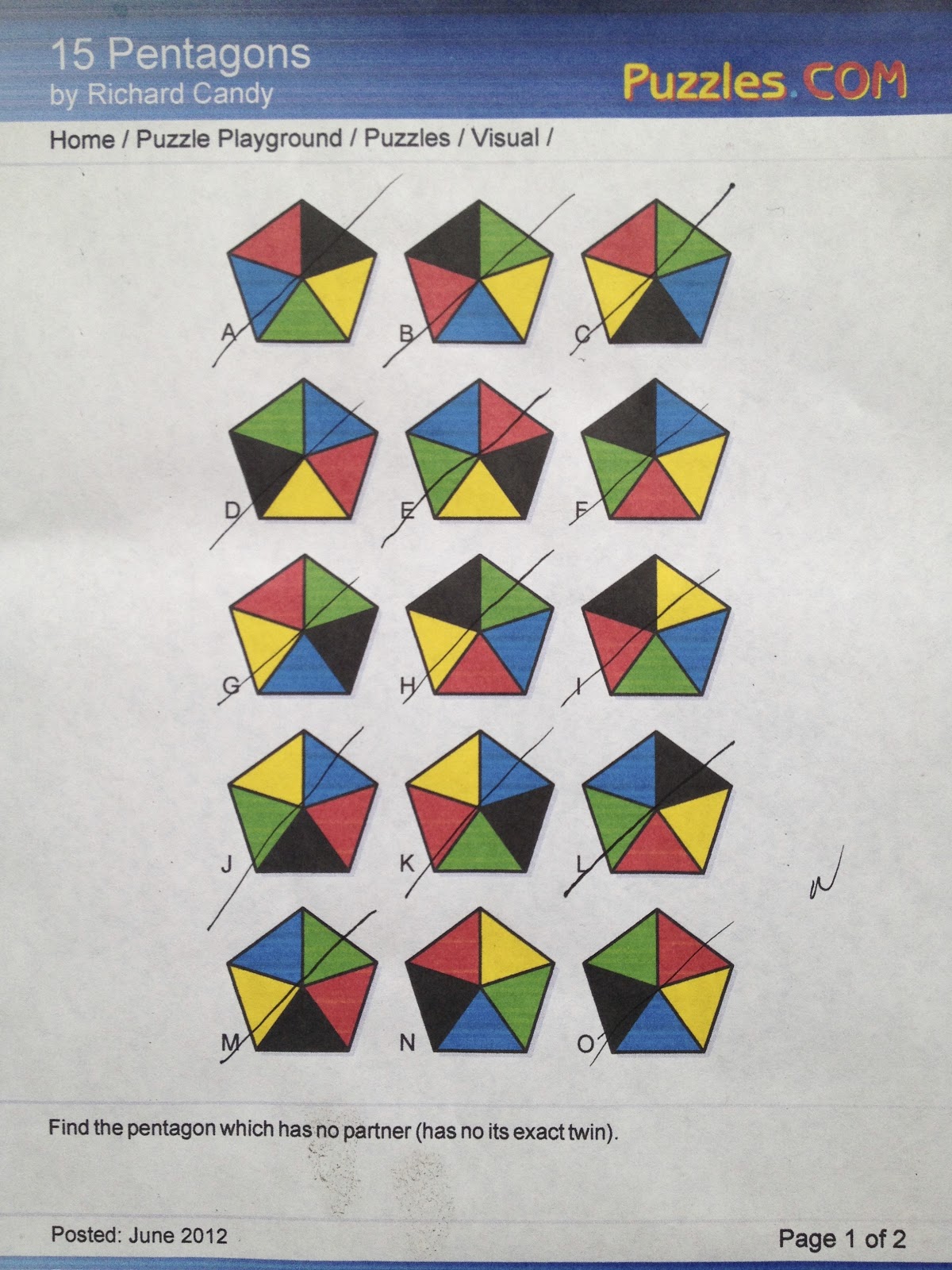
I chose option 2 for the motion blog.

The first example of navigation I chose is cell phone user interface. In particular the iPhone interface. Designing an interface for a Smartphone with smooth transitions and an unambiguous layout must be very challenging. Of course the basic layout and interactive features are just updated now, but the first design must have been time consuming, challenging and fun.

For the design to be successful, it had to be user friendly. When you start to navigate a iPhone, you must first unlock it. The locked screen is simple. The time is displayed with the phones background visible. The words slide to unlock are written at the bottom of the screen. The words light up from left to right in the direction you are supposed to slide. Also, the button you slide has an arrow pointing in the direction you need to slide it. This implied motion helps the user understand what they have to do to get the device unlocked. This is a unique way of overcoming the challenge of showing the user how to access their phone.


Once inside the phone, the user can easily find their way around. The designers have overcome the challenge of navigation through touch. The phones apps are laid out on the home screen. Moving you finger from left to right switches between the different pages of apps. Similar apps can be placed into folders and named accordingly. The folder is in the shape of a square. The apps are visible inside the square (tiny pictures of the different apps side by side). To go into a folder, the user simply has to touch it. The contents are then enlarged so the user can easily touch on them to access the app.


Finding a way to allow the user to delete or move the apps must have been a challenge for the designers. How would you know that the apps are ready to be deleted? Should there be a delete button? This problem was solved in a unique way. To change the location of any folder, or to delete an app, the user must hold down on any selected folder or app. After one second, all the folder and apps begin to shake. This unique motion only happens in this setting and it notifies the user they have transitioned from into the editing mode. The apps can be discarded or moved around in basically any way.
(Folders here are in edit mode)
The phone has a finder option that allows the user to locate anything within the phone. This is useful when the phone is cluttered with apps and information. Keywords are typed into the finder field and anything with that word pops up.


Starting from scratch must have been challenging for the design team. Integrating aesthetics with easy and proper function on a new technology must have been time consuming. Researching what works and what doesn’t work must have been time consuming as well. Prototyping a groundbreaking concept like a Smartphone would have been a fun and challenging experience.


The second example of navigation I chose is Adobe software programs. Illustrator for example, has a lot of tools the user can choose form. Finding these tool can very challenging as well. The programmers have done a decent job of laying everything out, which makes the user experience smooth.

When you open a blank document, you are immediately shown your document setup options. You can get started setting up various specs of the document like size, bleeds, margins, etc. Clicking OK moves you directly to the workspace. 


The bar on the top shows you all that you are in illustrator, and lays out the options you have for editing. The tools are also laid out on the left, and additional tool pallets are located on the right. You can move these around freely to position them just how you want them. The options on the top bar expand to reveal even more editing options. It is fairly easy to locate tools within the software. If you can’t find something, you can type what you are looking for in the search field located in the top right section of the software.


The layout for Adobe software is similar from program to program. Keeping this similarity makes it easy to learn programs. A challenge the programmers must have faced is categorizing all the options and tools you have for editing. The drop down menus can get overwhelming. By creating drop down menus that are categorized, the programmer have made the adobe suite relatively user friendly. It is likely that more tools will be added to future programs. Efficiently categorizing the tools could become a problem for the adobe team.

Wednesday, November 28, 2012

Dimension/Depth/Space/Scale

-->
Practically every product designer uses Computer Aided Design or CAD software in the development process. It helps visualize the product in a 3d virtual environment. The product can be altered and prototypes can be made, but the software enables the team to view the object or structure from different angles so changes can be made before prototypes are constructed. This coffee cup shows how you can see different angles with CAD software. 


CAD offers advantages when designing architecture as well. These models show how buildings and floor plans can be designed and altered in a 3D environment. 


The three examples show how software can help in the design process. They also show how important depth and size perception is when designing products and architecture.

The coffee cup provides a representation of the object in a virtual environment. There aren’t any cues that show how large it is in relation to anything else, but a coffee cup is a common object, so its relative size is understood. Shading and the overlap of the front and back walls of the cup provide the depth.

The models of the house and floor plan have more depth perception cues than the cup. Linear perspective is used and can be seen in both examples. The scenes get smaller towards the back than they do towards the front. Overlap can be seen in the trees as well as shading (the tree furthest away is partially covered by another tree, and it is shaded darker than the others). The floor plan uses overlap, as well as relative size. The cubicles towards the back get smaller than the ones in the front. Also, the walls of the cubicles in the front partially cover the walls of the cubicles in the back.


References:

Architecture from outside:

Floor Plan:

Cup:

Wednesday, November 14, 2012

How Tone is Operating


How Tone is Operating: There are a couple examples of tone use in these Braun watches. For watch #1- Black is used for the numbers, notches, writing and the band. The light grey face of the watch sticks out from the dark black of the band. The black notches, writing, and numbers stand out against the grey face, making them readable. The second watch uses tone in a similar way, only the face is black, and the notches are white. The numbers are very difficult to read since they are a close tone to the black face. The contrast between the face and the symbols are what make them readable, or in the case of the second watch, unreadable.

How tone is interacting: Tone is interacting with line and shape elements in both of these watches. The lines of the watches interact with tone most importantly. The lines that mark the time are a contrasting tone when compared to the face. Also, the seconds, minute and hour hands are lines, and are also a contrasting tone. These lines (hands) are essential in the function of an analog watch. It is important to make these easily visible, and to make to noticeably different to the background.

How Color is Operating: Color is another design element of both these watches, just on a much smaller scale than tone. Both watches use two different colors to call attention to certain parts, yellow and red. These hues are basic and easily noticed. The second hand is yellow, and the date has a red arrow to the left of it. The second watch uses color in a much more subtle way. The seconds’ hand is a dark orange color. There is luminosity contrast at work in both examples. The first watch has more contrast than the second watch, making the colors stick out a little more.

How Color is Interacting: The color in both of these watches is again primarily interacting with the basic element of line. The yellow and orange color appears on the second hand in both the watches. These hands are lines. The color makes them noticeable, but the skinniness of the line (which is the second hand, and the smallest one) makes it less noticeable. Two angled lines that make an arrow form the red colored shape next to the date. The red color makes the lines stick out. The luminosity contrast it creates makes I more noticeable than if it where similar to the grey face.

Wednesday, November 7, 2012

Visual Elements of Surface Design

I chose surface design as the design field for this assignment. I'm gong to discuss the process of designing a pattern that could be used textiles or backgrounds or whatever it would look good on. 

The process begins with a series of lines. Lines are one of the most basic visual elements. The picture below has a few lines that are darker than the other lines and shapes. This is to show that they exist. These lines are the basics of this pattern. They are very similar to one another. The main difference is the direction they face. When more lines are added in purposeful directions, they begin to form the next basic visual element, shape.


The picture below shows all of the lines you saw above, with the addition of many more, and with complete opacity. The end points of the lines touch and overlap in places. This process creates certain shapes. With the same couple of lines, a pattern can be formed. The repetition of basic shapes (triangles and squares) creates a design that is suitable for surface design. This design could be applied to surfaces now, or it could be improved by adding a more complex basic visual element, color.


The image below is the same pattern we saw earlier, just with the addition of color. The black lines have been replaced with white lines. All of the triangles and most of the squares have been filled in with blue. Certain Squares have been filled in salmon color. Color can be a very powerful tool. It can change the entire feel of the design very quickly. Whether or not you are designing for textiles, web, industrial, etc, you should understand the power color has.


Thursday, November 1, 2012

Visual Thinking

Visual Thinking

The first puzzle I chose was Counting Triangles by Henry E. Dudeney. It was similar to the square counting puzzle we did in class. The star with a pentagon around it has a bunch of different triangles within it. We had to locate as many triangles as we could. I came up with 25, and my friend came up with 25 as well. We used similar techniques of pattern seeking when searching for triangles. We both began counting the obvious triangles, and counted each one in a circular motion. We noted that there are sets of different sized triangles. Each set had five triangles that were exactly the same. We didn’t find three of the sets. The total amount of triangles in the pentagon star equals 35.


The second puzzle we did was 15 Pentagons by Richard Candy. This puzzle has 15 pentagons (A-O). Each pentagon is separated into five different triangles. Each triangle is colored a different color, each color appearing in a section. There are seven pairs; meaning 14 of the pentagons have a twin. There is one that has a unique pattern. We had to find that unique pentagon. We had to study each pentagon and look for patterns. I used a matching technique. I looked at pentagon A, and matched it to its twin. This was basically a process of elimination. My friend began categorizing each pentagon based on individual traits. By the end, we both had figured out which one didn’t have a twin.


 Answer Keys


Thursday, October 18, 2012

Feature Hierarchy


This is an info graphic that was published on the website good.is. This info graphic shows the percentage of individuals who voted to ban or legalize same sex marriage, state by state. Motion, the most attention grabbing pre attentive feature, is not used here. Interactive info graphics, or those using some sort of animation, could take advantage of motion. Color, the second most effective attention-grabbing feature, is used to a somewhat decent effect here. The only color is in the rope running through the middle of the graphic. It is supposed to be a rope being tied into a knot. I suppose the rainbow color associates it with the LGBT community. The amount of attention this draws from the viewer is almost too much. It sticks out a little too much from the actual information printed in the background, which is all black and white. This represents how color can be a powerful tool in attracting attention. Another color difference (not really color but black and white difference) is the circles. Some are filled black, and others are filled white. You notice the three unfilled circles since their lack of color makes them stick out when compared to the black circles. The third pre attentive feature this graphic uses is size. Some of the black circles are larger than others. The size difference draws your attention to them more than the small ones. The information in the larger circles might be more relevant than the smaller circles.


References:


Website: WWW.good.is/

Thursday, October 11, 2012

Top-down Processing


 Top-down Processing


Ake Axelsson designed this chair. It is called Wood. The chair is made from solid beech. I chose this because of its simple design. When you approach a chair to sit down, you generally take a quick look at it before hand. You are looking for a purpose, which is the essence of top-down visual processing. Your goal is to sit down in this unfamiliar chair, so you want to make a few observations before you rely on the chairs structure, cleanliness, and surroundings. Your eyes make rapid fixations on the chair and what’s around it. You look at the seat and back rest. Is the chair dirty? Does it have a cushion? How comfortable will it be? Then you might scan the surrounding area. If there is a crazy person sitting in close proximity, you might look for another seat. Once you make these quick observations, you take more time looking at the chair as you approach it. These longer fixations are more in tune with your ultimate goal. The walk up to the chair might reveal something you didn’t see before hand. Maybe the leg of the chair is bent, or you overlooked a piece of gum stuck to the backrest. If these longer fixations don’t turn up anything unsettling, you take the chair as your seat.

Image: 
http://www.decoist.com/2010-11-19/an-amazing-chair-ake-axelssons-wood/

Thursday, October 4, 2012

Syntactical Guidlines - Design Success & Failure

-->

This is a picture of the Mimosa Coffee Table by Matt Carr. The continuous plank of wood creates a simple, yet functional piece of furniture. Magazines can be held in the center portion of the table, which when full, would provide literal and visual bottom weight. The symmetrical W shape of the furniture provides solid base, creating a sturdy coffee table.


This is a picture of a Three Legged Chair by Joaquim Tenreiro. The pattern created by gluing pieces of wood together creates a beautiful design. If you were to look at the chair from the front, the shape and color pattern would create a symmetrical design. In my opinion, the triangular base creates tension. The two planks in the front provide stability, but most of a persons weight is put on the back of the chair. The single leg in the back would support a weight, but any movement would result in the chair falling to one side.  


References:

Mimosa Image retrieved from

Three Legged Chari retrieved from
-->

Wednesday, September 26, 2012

Symbolic Language

 Economy


My Google photo search on “economy” produced a bunch a different images. A common theme among them were graphs with a downward slope, North America falling of the world or with a cross over it, or a picture of currency. I thought this one was unique compared to everything else. It shows tiny green houses and red hotels that you would find in a Monopoly game. They are all lined up in a grid. The camera is on some kind of macro setting so everything is really close. In the middle of the picture, there is a break in the rows of houses where two white die are placed. One is rolled to a six, the other rolled to a three. The dies are larger than any of the green houses and red hotels. They also cast large shadows that go to the left.

Abstract
Colorful
Gloomy
Gambling
Real
Debt
Mortgage
Bankrupt
Economy
Recession
Depression
Housing market
Failure
Bad planning
Stupid
American
Depreciation
Homeless
Opportunity
Family
American Dream


Dice = Gambling. Mortgages that where given away to people who didn’t qualify for them before 2008. These people didn’t think before they took out a six-figure loan, and were gambling with their future, especially those who refinanced. The value of homes had been increasing dramatically for years. They refinanced when their house was worth more. They gambled on that data thinking the value of the house wasn’t going to depreciate. When the bubble burst, their house was worth half of what they refinanced on.

House = The American Dream. Owning a home and raising a family might be a dream for many people.

Grid = The houses are all in a grid. A lot of homes are built in developments. All the houses are built to similar specifications right next to each other.

The composition of the image reinforces the feeling I have about the economy. We are currently in a recession, and have been in one for four years. A major reason for the recession was the housing market. Banks where rolling the dice when they gave out mortgages to any and every body that asked for one. It was bad planning and very stupid thing to do.

Thursday, September 20, 2012

Meaning 2 - Interactions between the three levels of meaning


 Representational

The actual image of a bicycle provides a great representation of what the bike is in a physical sense, especially since it is very common. There aren’t many parts of the bike that are covered, aside from the welds and some bearings. You can get an idea of how the bike works just by looking at a picture of one. The rider sits on the seat, holds on to the handlebars, and puts their feet on the pedals. The pedals are connected to the cranks that move the chain and wheels, providing forward motion. The frame creates the outline for certain abstract shapes. The frame also contains decals. Those decals are symbols for the manufacturer, as well as the model of bike. Also, the quality of the frame itself, give those symbols meaning and importance.


Abstract

We get an abstract view of the bike by reducing it to geometric shapes. Focus on the frame, wheels, and gears. The blue outline shows the shape of the frame, while the green circles show the shape of the wheels. The frame consists of a two triangles made from aluminum tubing. When these triangles are combined, they create a parallelogram. The sharp corners create a rough shape that does not have fluid lines, or smooth corners. This part of the frame does not imply circular movement. Instead, this is the solid part of the frame that holds and connects everything else together. Parts like the wheels and gears create softer, more fluid lines. These circular shapes imply movement, which is true since the gears and wheels spin in a circular motion, and are almost always moving when the bike is in motion. Although the shapes are abstract, when they are put together, they represent the bike as a whole. They also might depict what type of bike this is, a road bike.


Symbol

A closer look at the frame reveals a couple logos that are very important to the model of bike. CAAD9 is a name for the series of aluminum bikes made by the company. CAAD stands for Cannondale Advanced Aluminum Tubing, the 9 means ninth edition. The name CAAD has been used by the company for years now, and is known among cycling enthusiasts. Cannondale is known for producing very stiff, strong, and light aluminum frames. These qualities are sought after in road bikes. This name conveys those qualities Cannondale offers in this line. The other symbol seen on the bike is the C logo on the front. This is an abbreviation for the companies name Cannondale.

Thursday, September 13, 2012

Meaning 1

 
 Representational

This photograph was taken by Lee Picket in 1917. It shows a house affected by the Skyomosh river flood in Washington state. The image is a strong representation of the capabilities of water. The structure, and what is happening to it, does not necessarily have to be explained to the viewer. It is easily understood that the river to the left has expanded. The strength of flowing water has eaten away at the earth with such force, that it has taken the foundation out from under the house. The idea of home is conveyed through the structure. The situation the house is in, might evoke strong emotions in the viewer,  especially if they own a house. These emotions might also have an affect on a persons idea of owning a home, such as where they should build it, what kind of insurance they should get for it, safety of their family, evacuation plans, etc.

 
Abstract

Here is another, yet very different image of water. The photographer brings the subject of water very close to the viewer. The oval shape of the initial drop pushes the impact area to make the shape of a bowl on top of the water. Capturing water in such an abstract way shows a different side to water. The image of the house teetering on the river bank shows a forceful, destructive element. The picture above depicts the water in a calm sense. It might evoke soothing or relaxing feelings in the viewer.

 
Water Drop
Symbol

This is a free clip art image from Clip Art Guide. It is easily recognized as a drop of water. It seems like this is a symbol I have always had in my memory, but at a very young age, I was taught that this meant water. It depicts some essential features of water, like the color and shape. This simplicity found in most symbols makes them easy to understand at a young age. This also makes it easy for symbols to be understood internationally.


Images:

1) http://content.lib.washington.edu/u?/pickett,815
2) http://eegint.com/WaterEfficiency.html
3) http://www.clipartguide.com/_pages/0808-0809-1213-0532.html